Welcome to Simplify!
the p5-js project that renounces to details and works as simple as possible, even a five year old could understand!
The Idea
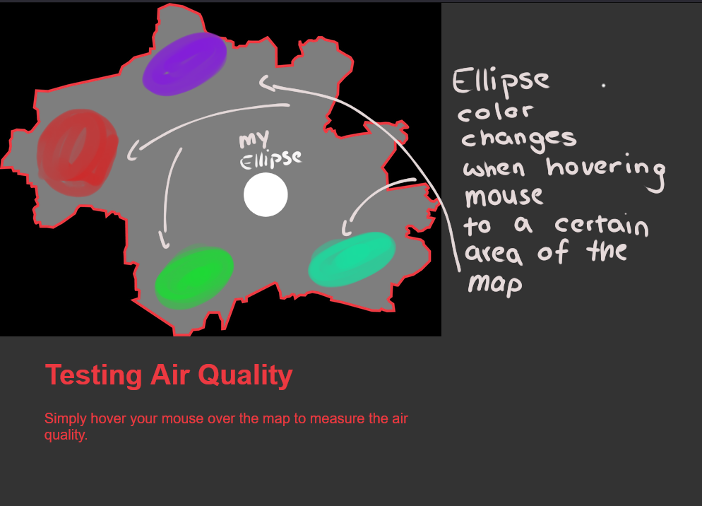
The task was to create an interactive webdesign based on p5-js. The Topic is about Air Data (Luftdaten) and particulate matter. My idea was to create a simple overview of the general Air index data by using color values to determine what is good and what is bad. We take Munich in this example.
It's like building Lego — except it isn't: How it came together
Nowadays everything is simplified in a Design perspective. Like many big companies logos, I wanted to take a similar approach with my project. I have an ellipse that changes its color within the map. The colors are set values that range from very good to very bad air quality. It is just a simple visualization. No numbers. Just Visuals.
Sketch